Client: AARP
Language: Chinese
Region: National
Role: Art Direction, Research, Copywriting
To Chinese Americans, AARP is a foreign concept since there is no similar organization in Greater China for the audience to relate to, and of course, the acronym name is not able to help the audience to understand what is it about in a glance. Unlike AT&T, CVS, or BMW, these brands offer an actual product and brick & mortar for consumer experience, AARP is a more difficult concept to grasp.
As an result, there remains misperception of what AARP represents and does, based on research results although the awareness of AARP is on the rise among Chinese American, there are still misconceptions that AARP is an insurance company or an organization related to Social Security or Medicare.
To make AARP immediately understandable and relatable, the creation and owning the AARP Chinese name vs have it defined by Chinese Media outlets is much needed in order to enhance the AARP brand identity when we developing in-language creative work.
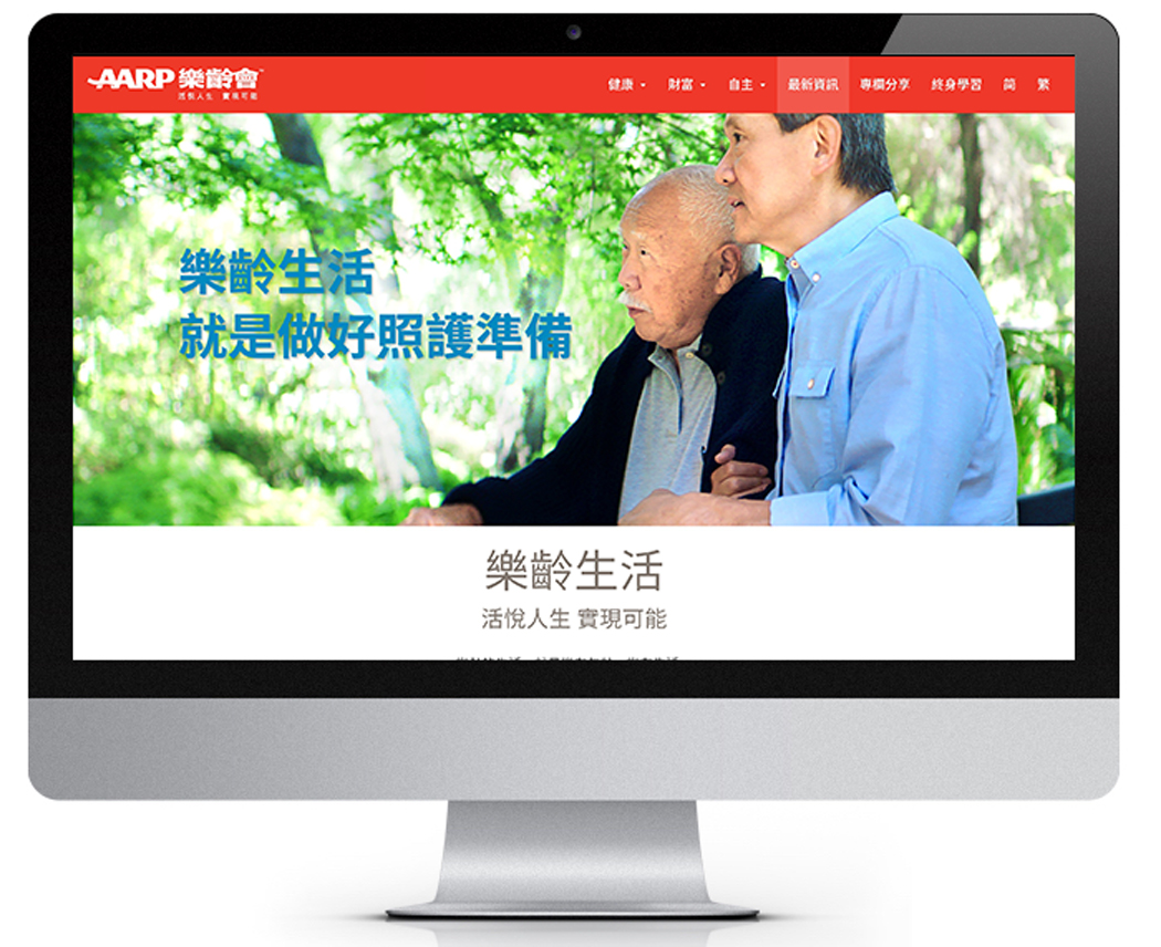
The biggest challenge of it is the 4 charactered name AARP doesn’t stand for anything themselves, it is impossible to translate the name of AARP. On top of that, since AARP is using the name as their logo, it may not be the best idea to substitute the English name with a Chinese one in order to avoid confusion and to keep the identity across segments. As an solution, a Chinese name is added after English as a lockup to capture the essence of the brand in a way that is memorable, own-able, easily understood, and most importantly applicable in Mandarin and Cantonese, while to reflex AARP’s spirit of communicating “aging” in a positive way.

Once the logo is done, its time for tagline, as good as “Real Possibilities” sounds, it is very lofty if translate in Chinese, so spinoff from it with the brand essence and meaning of real possibilities is much needed to better serve the purpose of convey AARP’s mission – to empower people to choose how they live as they age, in a very motivating and inspiring way. Here is where the Chinese tagline “Proactive and joyful life, realize possibilities” is born, based on the interpretation of what real possibilities means to our target group.

Base of the research of Sparkle Insight 2017, the target audience found this logo and tagline straightforward, informative and uplifting.


