Client: Verizon
Language: Chinese/Korean
Region: National
Media: Online
Role: User Interface; User Experience; Information Architecture; Visual Experience; Web Development; Art Direction
Website and Mobile site revamp for Verizon FiOS on 2011 and 2013.
Revamp 2011
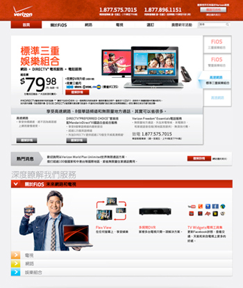
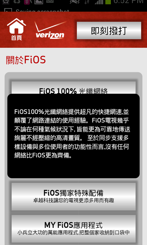
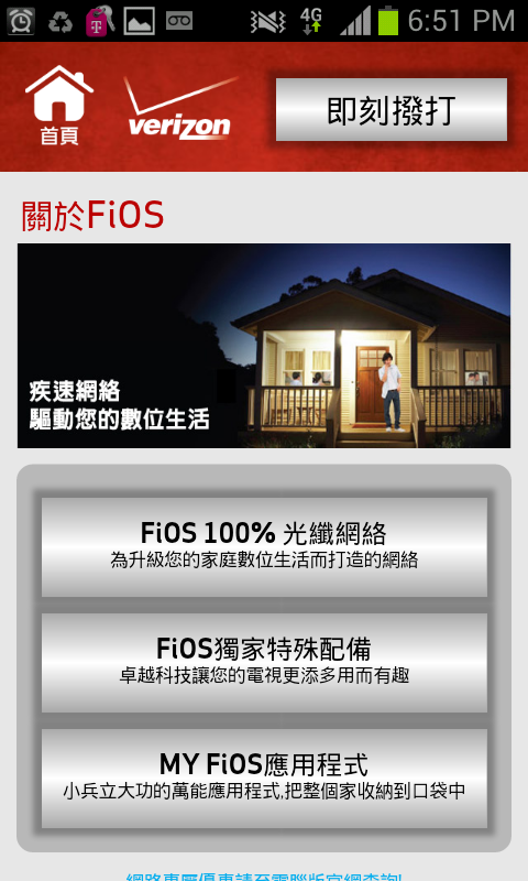
Revamped Verizon Asian sites the first time to attract Asian in-language dependent consumers to the Asian microsite by improving the site performance, including a complete makeover in structure, layout, content and format, also made the site more search engine friendly. To improve on sales by raising awareness, interest, search visits and visit length.



Result?
- Total inquiries and qualified inquiries improved by 74% and 44% respectively in one quarter
- The HTML format helped to increase traffic through search engine by 192%
- Achieved an extremely efficient rate of 54% more efficient in CPC and 8% more efficient in CPLQS
Revamp 2013

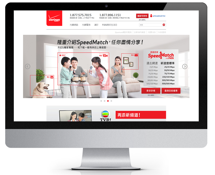
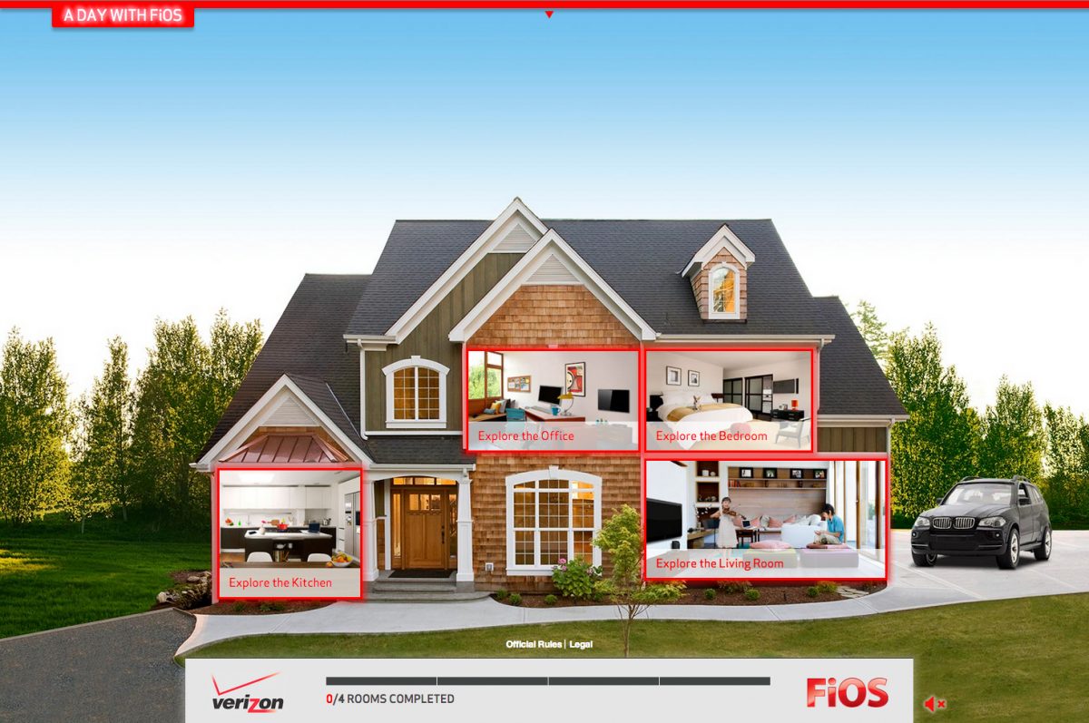
In 2013, as many features and overall flow are no longer best suit the consumers’ needs, I have used the brand revamp as an opportunity to once again improve infrastructure, enrich content, and enhance user experience and user interface while making the required changes on looks, in hope to boost up user engagement and easier understand of our product and promo. After analyzed the data collected, I have made changes with categories and information flow, also totally rearrange information on different pages to better serve our audiences. I have also introduced and infused interactive and gamified modules to entice users to learn more about each aspects of the product, as well as modules suggesting add-ons and upgrade options to users to maximize their entertainment experience and enjoyment with FiOS according to their needs. On top of that, I have improved the capability of the CMS while improving the usability and efficiency of the system.
Result:
- Average visit length increased by 10%
- Further improve CPC and CPLQS by another 5% from the already extremely efficient average
- Minimize cost for future updates

