Client: AARP
Language: Chinese
Region: National
Media: Online
Role: User Interface; User Experience; Information Architecture; Visual Experience; Art Direction


Asian Americans spend a total of 19.1 hours online a week, more than any other segment, it is almost a no-brainer that AARP must take advantage of the Chinese American community’s increasing digital savviness to start conversations and be a part of their lives in an authentic and helpful manner.
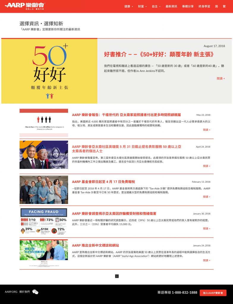
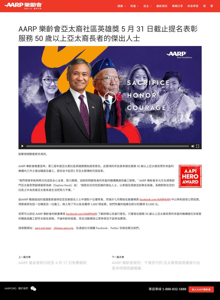
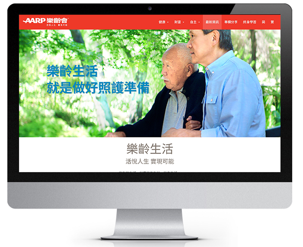
While a Chinese website is much needed to provide a more immersive experience to demonstrate AARP’s value with informative content for our Chinese in-language preferred audiences; it also serves as the holistic in-language digital hub that help support a more integrated and seamless experience that allows cross promotion on AARP’s value propositions to be further communicated.

As I mentioned earlier, this website is designed not only to provide a go-to place for every campaign for users to further explore information based on the campaign message, it is also serve as a digital hub for Chinese American users to further explore AARP’s offerings, include resources and information, news, and events.
While the goal is to provide as much information as possible to the audience, I am trying to keep the site simple, intuitive and relevant to 50+ Chinese American, especially when the information of AARP’s database is huge and expansive, hence, it is not easy for audience to access the information of their interests.
To avoid cluttering the site with multiple categories and levels of sub-categories, I successfully grouped information into 3 pillars, based on the most fundamental reasons of our target audience looking for information, which is because they want to learn more about “health”, “wealth”, and “self fulfillment”. And all information are categorized accordingly so it would be easier for the user to find information based on their interests.
Result:
Within the first year of the site launch, Over 2,300 clicks on “Join AARP”, and over 715 clicks on “call AARP”


